
“Input elements should be organized in logical groups so that
your brain can process the form layout in chunks of related fields.”
–HTML:
the Definitive Guide
Quite rare is the Web application that doesn’t make extensive
use of forms for data input and configuration. But not all Web applications
use forms consistently. Variations
in the alignment of input fields, their respective labels, calls to
action, and their surrounding visual elements can support or impair
different aspects of user behavior.
Form Layouts
When the time to complete a form needs to be minimized and the data
being collected is mostly familiar to users (for instance, entering
a name, address, and payment information in a check-out flow), a vertical
alignment of labels and input fields is likely to work best. Each label
and input field is grouped by vertical proximity and the consistent
alignment of both input fields and labels reduces eye movement and processing
time. Users only need to move in one direction: down.
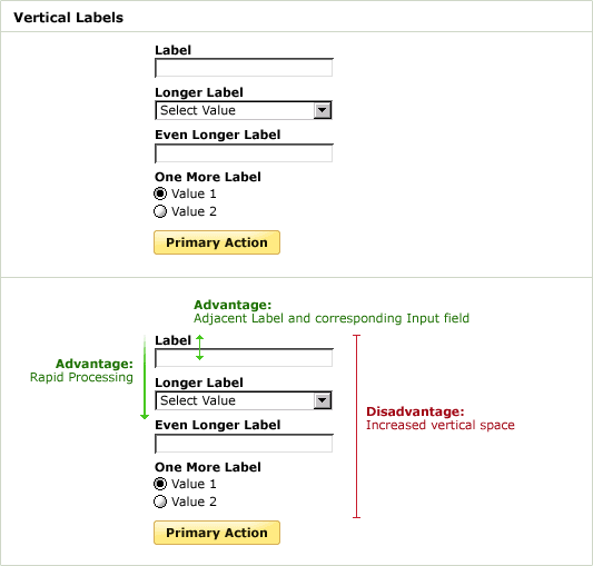
In this layout, it’s advisable to use bold fonts for input field
labels. This increases their visual
weight and brings them to the foreground of the layout. When they
are not bold, labels may compete with input fields for a user’s
attention as they have almost equal visual weight.
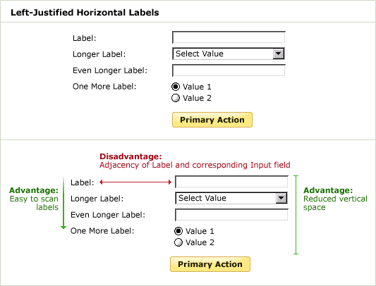
When the data being collected by a form is unfamiliar or does not fall
into easy to process groups (such as the various parts of an address),
left-justifying input field labels makes scanning the information required
by the form easier. Users can just scan the left column of labels up
and down without being interrupted by input fields. However, the distance
between the labels and input fields is often elongated by long labels,
and as a result, completion times may suffer. Users have to “jump”
from column to column in order to find the right association of input
field and label before inputting data.
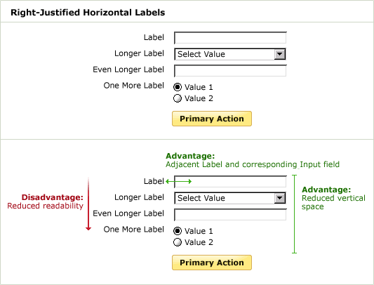
An alternative layout, right aligns the input field labels so the association
between input field and label is clear. However, the resulting left
rag of the labels reduces the effectives of a quick scan to see what
information the form requires. In the Western world, we read from left
to right, so our eyes prefer a hard edge along the left side.
Using Visual Elements
Due to the advantages of a “left-justified horizontal label”
layout (easy scanning of input labels and reduced vertical screen space),
it may be tempting to attempt to rectify its primary shortcoming: the
separation of input fields and their respective labels.
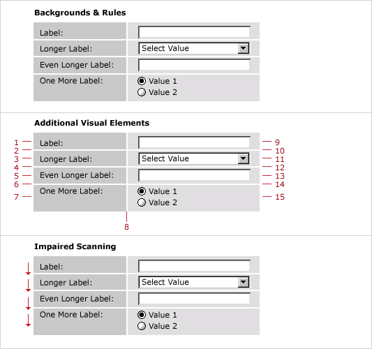
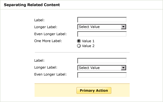
One such
approach features the addition of background colors and rules: the
different background colors create a vertical unit of labels and a vertical
unit of inputs; the horizontal rules form a relationship between each
label and input field pair. Though this approach may seem desirable,
it actually creates a few problems.
Through gestalt (our innate rules
of visual perception), an additional 15 visual elements are added
to the layout: the centerline, each background box, and each horizontal
line. These elements begin to distract our eye and make it more difficult
to focus on the most important elements in the layout: the labels and
input fields. As Edward
Tufte points out: “Information consists of differences that
make a difference.” In other words, any visual element that is
not helping your layout ends up hurting it. This can be seen when you
try to scan the left column of labels. Your eye repeatedly pauses to
consider each horizontal line and the box created by each combination
of line and background color.
Of course this doesn’t mean that background colors and rules
should never be used within form layouts. When there is value in pointing
out related groupings of information to users, a thin horizontal rule
or light background color can visually unite related data. Both of these
elements (rules and background colors) can be especially useful for
drawing attention to the primary call to action of a form.
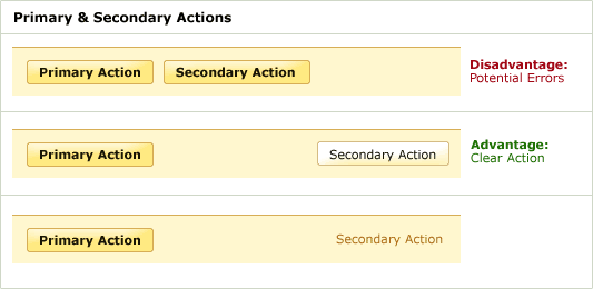
Primary & Secondary Actions
The primary action associated with a form (most commonly “submit”
or “save”) needs to carry a stronger visual weight (in the
example above bright color, bold font, background color, etc.) than
the other form elements and should vertically align with the input fields.
This illuminates a path for users and guides them to completion of
the form.
When a form has multiple actions such as “Continue” and
“Go Back” it may be wise to reduce the visual weight of
the secondary action. This minimizes the risk for potential errors and
further directs users to completion.
Though these guidelines can help better position a form for your specific
purpose, the combination of layout, visual elements, and content that’s
right for you should still be verified through user testing or data
analysis (completion rates, errors, etc.).
http://www.lukew.com/resources/articles/web_forms.html